top of page

All Posts


How to Tell if Your Brand Guide is Built with Accessibility in Mind
Most brand guides tell your team how the brand should look.
Very few tell your team how to make the brand accessible.
They may explain how to use the logo, colors, fonts, photography style, tone of voice, and layouts. But many brand guides miss the deeper questions.
Amy Pedid
Jun 88 min read


Post-Valentine’s Day Reflections: Evaluating Your Brand Relationships
Valentine’s Day is loud about love. February 15th is quieter—and honestly, more interesting. Because post-Valentine’s isn’t just about chocolate wrappers and receipts. It’s that little emotional hangover where you realize: some choices felt cute in the moment… and then didn’t. That’s the exact feeling many people have about the brands they buy from every day. Not because they’re “bad” people. But because modern shopping is built for speed: Quick taps Quick dopamine Quick “add
Amy Pedid
Feb 164 min read


The Importance of Accessible Graphic Design for All Businesses
Creating graphics that everyone finds moving is more important than ever to every size of business. When teams plan beyond aesthetics and target markets by focusing on accessibility and usability for all they can ensure their reach multiplies in effectiveness. This kind of strategy is especially helpful to those who have ethical brand values and a diverse audience, including those with disabilities or different cultural backgrounds.
The Sage Mages
Jan 255 min read


Accessible Typography: Why Rolling Back Accessibility Changes Hurts Everyone
A font change shouldn’t be front-page news. And yet here we are because we know this one has the ability to impact millions of lives. In early December, the U.S. State Department directed staff to return to Times New Roman and stop using Calibri, reversing a 2023 shift that was introduced to improve readability and accessibility for people with disabilities.
The Sage Mages
Dec 15, 20254 min read


Understanding Brand Accessibility: A Comprehensive Guide
The Importance of Accessibility in Branding When people hear the word accessibility , they often think of websites or buildings. This includes ramps, captions, alt text, and crosswalks. While these tools are essential, they only address accessibility at specific points in a customer journey. They are just a part of what can be measured through a customer's experience. Brand accessibility starts much earlier. It affects every interaction point and can be easily measured. It li
Amy Pedid
Nov 16, 20256 min read


Discover How Inclusive Design Elevates Creativity
In today’s fast-evolving world, creativity is a key driver of innovation and success. But how can we ensure that creativity is not limited by barriers or exclusions? The answer lies in accessible design principles.
The Sage Mages
Oct 18, 20253 min read


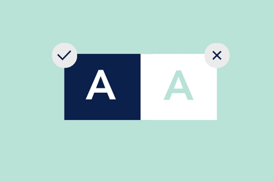
Choose the Right Contrast for Your Brand Color Palette
Color does more than beautify; it communicates, interacts with, and includes diverse audiences. However, without mindful contrast, it can also exclude. Whether you're selecting brand colors or applying them across platforms, ensuring sufficient contrast isn't just a design choice, it's an accessibility imperative.
Amy Pedid
Jul 31, 20252 min read


They Crawled So We Could Access: Remembering the Real Fight Behind the ADA
Source: Photography by Tom Olin Today, July 26th, marks the 35th anniversary of the Americans with Disabilities Act (ADA). A landmark...
Amy Pedid
Jul 26, 20252 min read


Accessibility Awareness Week – Logo: Is It as Memorable as You Think?
A logo isn’t just a visual mark. It is the handshake, the greeting, the first impression of your brand, and long after the interaction, it’s what holds the memory, the meaning… and the reputation.
Designers often quote Jonathan Hoefler, co-creator of the NYC Subway’s iconic typeface: “A logo is like an outfit. It should be appropriate for the occasion, flattering to the wearer, and memorable to the observer.”
Amy Pedid
May 13, 20252 min read


Accessibility Awareness Week – Tone: Is Your Brand Speaking the Language of Trust?
Imagine walking into a room where everyone speaks over you, or worse, not to you at all. That’s what tone of voice can feel like when a brand misses the mark. Tone isn’t just what you say, it’s how you say it. And for diverse audiences, that tone can invite or exclude to an intense amount.
Amy Pedid
May 12, 20251 min read


More Than Just Web Design: How Accessibility Shapes Every Brand Touchpoint
From digital content to in-person touch points, accessibility isn’t an extra step. It’s the foundation of effective branding.
Amy Pedid
Mar 27, 20253 min read


Beyond the Podium: How Special Olympics Leads the Way in Inclusive Branding
As the Special Olympics World Winter Games in Turin, Italy came to a close, the world celebrated not just the athletes’ incredible...
Amy Pedid
Mar 18, 20252 min read


Designing the Future: Lessons from this Year's University Portfolio Review
Last weekend, I had the privilege of volunteering with AIGA NWA at the annual Student Portfolio Review. Here are my takeaways.
Amy Pedid
Mar 17, 20252 min read


Building an Inclusive Brand: 6 Brand Guide Essentials for Inclusive Impact
For many businesses, inclusive branding is a priority in their business initiatives, but does their brand guide reflect it? Find out how!
Amy Pedid
Feb 10, 20254 min read


Inclusive Design Meets Pantone’s 2025 Color of the Year
Every year, designers, brands, and creatives look to Pantone’s Color of the Year for inspiration even with a mixed reaction.
Amy Pedid
Dec 16, 20244 min read


Top 4 Inclusive Design Mistakes to Avoid in 2024
Overwhelmed by trends? Focus on avoiding these four mistakes to find long-term success.
Amy Pedid
Jan 2, 20243 min read


Accessible Event Case Study: Know Your Network with runZero
Creating inclusive design that reveals a memorable brand experience for potential clients.
Amy Pedid
Sep 15, 20233 min read
Successfully Impact an Audience with Inclusive Campaigns
Stuck on how to improve inclusive design on a budget? The Sage Mages are giving away their top six steps to boost engagement and SEO.
Amy Pedid
Jul 25, 20233 min read

Unlocking the Power of Inclusive Design with One Question
Our customers deserve more than just vanilla content. Learn a few simple ways to prompt diverse engagement.
Amy Pedid
Jun 26, 20233 min read

Top 10 Tools To Streamline Business Tasks
The Sage Mages reveal their favorite business tools to improve efficiency and long-term success.
Amy Pedid
Apr 20, 20234 min read
bottom of page