
Why We Celebrate ADA Guidelines in Graphic Design


The ADA, a Case Study of Great Graphic Design
The Smithsonian’s National Museum of American History preserves many artifacts from the disability-rights movement, including handwritten protest signs, campaign buttons, photographs, shirts, and policy materials. One example is a 1989 “Support ADA” button created while the proposed law was being debated in Congress. Other materials carried messages about access, equality, justice, power, and civil rights.
These designs were often direct rather than elaborate. Their purpose was not simply to look attractive. They needed to express a demand, communicate a shared identity, and move people toward action.

That is one of the most important lessons designers can take from this history: effective visual communication is not measured only by originality or beauty alone. It is measured by whether people can understand the message, recognize what is at stake, and participate in what comes next.
The disability-rights movement used design as infrastructure for advocacy. Visual materials helped supporters identify one another, helped the public recognize the movement, and helped lawmakers see that disabled people were an organized political community demanding enforceable rights.

The ADA Expanded the Meaning of Successful Design
Signed into law on July 26, 1990, the ADA was created to protect people with disabilities from discrimination in employment, transportation, government services, public accommodations, and other major areas of public life. It established a clear civil-rights expectation: people with disabilities should have equal opportunities to participate in everyday American life.
The ADA established a broader responsibility to avoid disability discrimination and provide equal access. That responsibility has major requests for pubic communication design.
Graphic designers and brand designers create materials that help people understand services, find locations, attend events, complete forms, make purchases, and participate in programs. A designer may create the brochure explaining a public service, the signage guiding someone through a building, the social graphic announcing an opportunity, or the PDF a customer must read before taking action.
The design of those materials affects whether the communication is truly available to the audience.

The ADA therefore changed more than architecture and physical access. It strengthened the expectation that information, services, and experiences should not exclude people because of disability.
Traditional design education often emphasizes hierarchy, consistency, memorability, emotion, differentiation, and visual appeal. Those qualities still matter. But the ADA guidelines for graphic design asks us to consider another measure of success:
Can people actually access and use what we designed?
A striking campaign may fail when Deaf viewers cannot access its video message. A refined report may fail when someone with low vision cannot read its type. A beautiful event graphic may fail when all essential information is locked inside an image that a screen reader cannot interpret.
In each case, the design may look successful to the creative team while creating exclusion for part of the audience.
The ADA helped shift access from an optional act of kindness toward a civil-rights responsibility. That shift should affect how designers judge their own work.

The ADA Proved Color is Vital for Functionality
Color has always carried emotion and meaning in graphic design. It attracts attention, creates hierarchy, signals personality, and builds recognition.
Accessibility adds another responsibility: color (both print and digital) must also allow people to perceive the information. With this knowledge, a brand palette can no longer be treated only as a collection of attractive swatches.
Designers need to use a color contrast checker and guidance of the disability community to consider how those colors behave when used for body copy, buttons, links, forms, diagrams, presentations, social content, signage, and print.

A pale color combination may look sophisticated in a brand presentation but become unreadable when used for a call to action. A chart may appear clear to one viewer while becoming confusing to someone with a color-vision deficiency. A message communicated only through red or green may disappear when those colors cannot be distinguished.
Accessibility has helped move color selection from a primarily expressive decision toward a system-performance decision.
A brand color must not only represent the organization. It must also function when someone needs to read, navigate, compare, or act.
Typography Became an Access Decision
Typography is another area in which accessibility changed the definition of functional brand design.
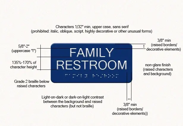
Brand fonts are commonly selected for personality, history, or emotional tone. But type is also the primary vehicle for information. When lettering is too thin, condensed, decorative, small, or tightly spaced, the brand’s message can become difficult to access.
For someone with low vision, dyslexia, visual-processing differences, or eye strain, typography can determine whether reading feels manageable or exhausting.

The same barriers may affect someone reading on a small phone, in bright sunlight, through a low-quality printout, or after hours of screen use.
This means typography cannot be evaluated only at the ideal size shown in a brand guide. It must work across mobile screens, PDFs, long paragraphs, captions, forms, presentations, emails, and signage.
A brand font does not succeed only when it looks distinctive. It succeeds when people can continue reading.
Images and Media Became Shared Information
Images have always helped brands communicate mood, values, products, and human stories. Accessibility requires designers to consider what happens when a person cannot see the image.

Alternative text, or text-to-speech, allows the purpose or meaning of an image to be communicated in another format. That makes accessibility more than a technical task assigned at the end of a project.
Designers often understand why an image was selected, what message it supports, and what emotional role it plays. That context can be essential when describing it.
The same principle applies to video, animation, and motion graphics.

Closed caption and audio descriptions support people who are Deaf, hard of hearing or just prefer no sound. Audio descriptions can communicate important visual information to those who are blind, have low-vision or prefer not to look at the screen while understanding the information. Motion controls and thoughtful pacing can also reduce barriers for people with vestibular, sensory, or neurological disabilities.
These features affect composition, timing, storytelling, and layout. They belong early in the creative process because they shape the media itself.
Accessibility changes the way we understand visual content. Images and videos are not only things to be seen. They are information that may need to be received in more than one way.
Brand Guidelines Become More Than Consistency Manuals
Historically, brand guides have focused on protecting visual consistency. They explain how to use the logo, which colors are approved, what fonts belong to the system, and how layouts should look.
Accessibility reveals the limits of that approach.

A guide that identifies the brand’s blue but does not explain whether white text is readable over it is incomplete.
A guide that specifies a decorative font but does not explain where it becomes difficult to read is incomplete.
A guide that establishes a photography style but says nothing about alternative text, captions, or disability representation is incomplete.
A guide that provides social templates built from image-based text but offers no accessible alternative is incomplete.
The ADA’s larger civil-rights legacy challenges brand designers to think beyond consistency and consider access.
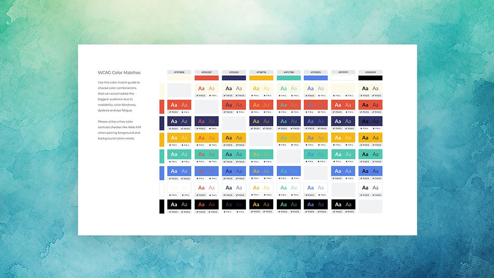
A modern brand guide should help teams communicate the identity consistently and use it without repeatedly creating barriers. That can include guidance for color contrast, text hierarchy, image descriptions, caption placement, readable documents, inclusive language, and accessible digital applications.
This is where the ADA’s influence extends beyond one campaign. When accessibility is built into a brand guide, it can scale through every department, vendor, template, and platform that uses the brand.
The ADA Changed Who Designers Are Expected to Consider
Perhaps the ADA’s greatest influence on design is not a single technical requirement. It is the expectation that disabled people have always been in the audience and deserve accommodations.
Before disability rights became widely recognized as a civil-rights issue, designers could more easily treat disabled people as a niche group, a medical audience, or an afterthought.
The ADA sent a clear message.
Those with disabilities are employees, customers, students, travelers, patients, voters, leaders, parents, creators, and business owners. They interact with brands across nearly every industry and every stage of life.
When designers create for the public, disabled people are already part of that public.
This should influence more than technical access. It should shape audience research, visual representation, language, user journeys, testing, and the people invited into the design process.
The ADA made a powerful cultural statement: exclusion is not inevitable simply because it has been normalized.
Designers have the ability to question that normalization.

Why the ADA Guidelines for Graphic Design are Historical
The ADA belongs in graphic-design and brand-design history for two connected reasons.
First, visual communication helped disability-rights advocates make their movement recognizable. Signs, buttons, symbols, photographs, shirts, and public messaging helped turn lived exclusion into a visible civil-rights demand.
Second, the law changed the expectations surrounding communication. It helped establish that access to information, services, places, and opportunities cannot be separated from the rights of disabled people.
That legacy continues to affect how designers approach color, typography, images, video, documents, websites, signage, templates, and brand standards.
The ADA reminds designers that communication is never neutral. Every visual system makes assumptions about who will see it, hear it, understand it, and use it.
Those assumptions can reinforce exclusion, or they can help remove it.

Accessibility Is Part of Design History and Design’s Future
Graphic design helped give the disability-rights movement a visible public identity. Today, graphic designers and brand designers have the opportunity to carry that history forward.
That does not mean every designer must become an attorney or accessibility engineer. It means understanding that the work has consequences beyond aesthetics.
Color affects perception. Typography affects comprehension. Images affect access and representation. Video affects participation. Documents affect whether people receive essential information. Brand guidelines affect whether accessibility is repeated consistently or forgotten under pressure.
The ADA changed American civil-rights history. It also changed what responsible communication should accomplish.
For designers, its lesson is clear: a brand is not fully successful when it is merely recognizable. It is successful when the people it hopes to reach have a meaningful opportunity to recognize, understand, and engage with it.
Is Accessibility Part of Your Brand’s Design History?
Many brand guides still document how an identity should look without explaining how it should remain accessible. That leaves designers, marketers, and developers to solve the same problems repeatedly—or overlook them entirely.
The Sage Mages evaluate brands through six connected lenses: tone, logo, color, fonts, media, and user experience. Our goal is to help organizations understand where accessibility already exists in their brand system, where barriers may be developing, and how design decisions can create stronger access, trust, and participation.
To learn more about a Brand Accessibility Audit, email hello@thesagemages.com or complete our Brand Accessibility Questionnaire.


Comments