
How to Tell if Your Brand Guide is Built with Accessibility in Mind
- Amy Pedid

- Jun 8
- 8 min read
Most brand guides tell your team how the brand should look.
Very few tell your team how to make the brand accessible.
They may explain how to use the logo, colors, fonts, photography style, tone of voice, and layouts. But many brand guides miss the deeper questions:
Can people actually read what we create?
Can they understand it quickly?
Can they access it with assistive technology?
Can they use our PDFs, social graphics, videos, slides, emails, and website content without unnecessary barriers?
If your brand guide does not answer those questions, your team may be creating inaccessible brand assets without realizing it.
And that is more common than most brands think.

Most Brand Guides Were Not Built for Accessibility
Most companies are not ignoring accessibility because they do not care.
They are missing it because traditional brand guidelines were built to protect visual consistency, not access.
They often focus on:
Logo usage
Color palettes
Typography
Photography style
Voice and tone
Layout examples
Those are important. But without accessibility standards, they are incomplete.
An accessible brand guide should also explain how to make brand assets readable, usable, understandable, and inclusive across digital and print touchpoints.
That includes your website, social media graphics, email templates, PDFs, presentations, videos, lead magnets, and marketing materials.

Why Many Businesses Are Still Early in Brand Accessibility
There is not yet a large public study that scores brand guides specifically for accessibility. But we do know accessibility gaps are still widespread thanks to data on website accessibility.
WebAIM’s 2026 report found that 95.9% of the top 1,000,000 home pages had detectable WCAG failures. That tells us accessibility issues are still common, even among highly visible websites.
The need is also large. The CDC reports that more than 1 in 5 adults in the United States hav a permanent disability, and the World Health Organization estimates that about 1.3 billion people globally experience significant disability.
For small businesses, this gap makes sense. Many do not have in-house accessibility experts, UX teams, legal teams, or brand governance systems. They may be relying on a designer, marketing contractor, template, or old brand guide that was never created with accessibility in mind.
So if your brand guide does not yet include accessibility, you are not alone.
You are likely in the early stage of building a more accessible brand system.
What Is an Accessible Brand Guide?
An accessible brand guide is a brand standards document that helps your team create brand assets more people can read, understand, navigate, and trust.
It does not only say what looks good.
It explains what works for more people.
An accessible brand guide should include standards for:
Tone of voice: plain language, clear calls to action, inclusive wording, acronym guidance, and respectful messaging
Logo usage: legibility at small sizes, high-contrast versions, light and dark background rules, simplified marks, and alt text examples
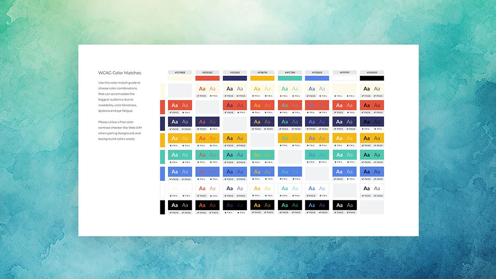
Color accessibility: contrast-tested color combinations, accessible text/background pairings, and guidance to avoid using color alone to communicate meaning
Typography: readable font sizes, accessible weights, line spacing, paragraph spacing, hierarchy, and fallback fonts
Media: alt text, captions, transcripts, audio descriptions, inclusive imagery, and animation guidance
User experience: button labels, form guidance, PDF structure, email readability, mobile layouts, and clear navigation patterns
At The Sage Mages, we evaluate brand accessibility through six core areas: tone, logo, color, fonts, media, and user experience. These areas help translate accessibility from a website-only concern into a full brand guide system.
How to Evaluate Your Brand Guide for Accessibility
A helpful way to evaluate your brand guide is to look at how much accessibility guidance it gives your team.
Does it simply show brand elements?
Or does it teach your team how to use those elements accessibly?
Below are three common levels we see when reviewing brand guides.

Level 1: Your Brand Guide Has Basic Brand Standards, But Limited Accessibility Guidance
This is the most common stage for many small businesses and growing companies.
Your brand guide may be beautiful and useful, but it mostly focuses on visual consistency.
Accessibility may be missing, vague, or handled outside the guide.
This means your team may care about inclusion, but still have to guess how to create accessible assets.
Signs Your Brand Guide Is at This Level
Your brand guide may be at this level if:
Your color palette is listed, but accessible pairings are not documented.
Your fonts are named, but minimum sizes and spacing are not explained.
Your logo rules do not include small-size testing or alt text.
Your tone section explains personality, but not plain language.
Your photography section explains style, but not inclusive representation.
Your social templates are branded, but not checked for mobile readability.
Your PDFs and downloads look polished, but may not work well with screen readers.
Your accessibility process depends on one person remembering to check.
At The Sage Mages, we call this type of brand a Sprout Achiever.
A Sprout Achiever is aware of the impact of inclusive design and is taking early steps to accommodate diverse customer needs. It is not a failure. It is a starting point.
What to Improve First
Start by adding simple accessibility rules to your brand guide.
The easiest first updates are:
Approved color combinations for text and backgrounds
Minimum font sizes for web, social, slides, and print
Plain language rules for headlines and calls to action
Alt text examples for logos, photos, and graphics
Caption and transcript rules for video and audio
Examples of accessible and inaccessible layouts
The goal is to reduce guessing.
A brand guide becomes more useful when it tells people not only what to create, but how to create it accessibly.

Level 2: Your Brand Guide Includes Accessibility Standards, But They Are Not Fully Systemized
At this level, accessibility is no longer an afterthought.
Your team has started adding accessibility standards into your brand guide, templates, and review process. You may have contrast-tested colors, clearer CTAs, better font rules, or caption guidance.
But the system may still be incomplete.
Some assets are accessible. Others are not. Some team members know the rules. Others are still guessing.
Signs Your Brand Guide Is at This Level
Your brand guide may be at this level if:
Your color palette includes some contrast-tested combinations.
Your typography section includes readable sizes and hierarchy.
Your tone guide includes plain language reminders.
Your logo guidance includes responsive versions or simplified marks.
Your media guidance mentions alt text, captions, or representation.
Your templates are more accessible than before.
Your team reviews some assets before publishing.
Accessibility is included, but not yet built into every section.
At The Sage Mages, we call this type of brand a Sustained Champion.
A Sustained Champion is actively leading inclusive initiatives across visual, messaging, and experience areas. This brand is serving a range of needs well, but still has room to make accessibility more consistent.
What to Improve First
The biggest opportunity is turning accessibility effort into repeatable systems.
That may include:
A brand accessibility checklist inside your brand guide
Accessible social media templates
Accessible Google Slides, Canva, or PowerPoint templates
PDF export and tagging guidance
Inclusive image sourcing rules
CTA examples for web, email, and social
Quarterly brand accessibility reviews
Training for designers, marketers, contractors, and content creators
This is where accessibility becomes easier to maintain as your team grows.
Level 3: Your Brand Guide Embeds Accessibility Across the Full Brand System
At this level, accessibility is part of the brand’s foundation.
The brand guide does not treat accessibility as an extra page, side note, or final checklist. It is built into the rules for tone, logo, color, fonts, media, and user experience.
The team is not only asking, “Does this look on brand?”
They are also asking:
Can people read it?Can people understand it?
Can people use it?Can people trust it?
Can our team repeat this accessibly without guessing?
Signs Your Brand Guide Is at This Level
Your brand guide may be at this level if:
Accessibility guidance appears throughout the full brand guide.
Every color combination has a clear use case.
Typography rules are tested across print, digital, mobile, and presentations.
Logo guidance includes contrast, size, simplified versions, and alt text.
Media standards include alt text, captions, transcripts, representation, and sensory considerations.
UX guidance connects brand consistency to clear navigation and action.
Templates are accessible before the team uses them.
Your team gathers feedback from real users.
Accessibility is reviewed regularly, not only during a rebrand.
At The Sage Mages, we call this type of brand a Sage Advocate.
A Sage Advocate is a model for accessibility and inclusion. This brand actively implements best practices across touchpoints and helps raise the standard for others.
What to Improve First
At this level, the opportunity is leadership and ongoing accountability.
That may look like:
Sharing your accessibility practices publicly
Creating case studies about inclusive brand improvements
Partnering with accessibility experts or disability advocates
Establishing internal accessibility champions
Tracking accessibility metrics
Auditing brand assets on a recurring basis
Expanding accessibility into hiring, onboarding, sales, and client experience
A truly accessible brand guide is never “done.”
It evolves as standards, technology, language, and community needs evolve.
The Real Question
The real question is not:
“Does our brand guide look professional?”
The better question is:
Does our brand guide help our team create accessible brand assets?
Because if your brand guide does not explain accessibility, your team has to guess.
And when teams guess, accessibility becomes inconsistent.
That is how brands end up with beautiful colors people cannot read, elegant fonts that strain the eyes, clever copy that confuses people, polished PDFs that screen readers cannot navigate, and videos that leave people out.
Most Brands Are Still Building This Skill
If your brand guide is still in the early stage, that does not mean your brand is bad.
It means your brand guide was probably created the way most brand guides have been created: to protect consistency first.
Now it needs to grow.
Most companies and small businesses are likely still early in brand accessibility because accessibility has historically been treated as a website, legal, or development issue instead of a brand system issue.
But brand accessibility begins much earlier than launch.
It begins when your team decides which colors are safe, which fonts are readable, which words are clear, which images are respectful, and which templates are usable.
It begins inside the brand guide.

Get Resources for Your Brand Accessibility Stage
Not every brand needs the same next step.
A Sprout Achiever may need simple starting points, like contrast-tested color pairings, plain language guidance, and alt text examples.
A Sustained Champion may need stronger systems, like accessible templates, team checklists, and clearer brand guide standards.
A Sage Advocate may need deeper accountability, like recurring audits, accessibility metrics, and support from experts with lived experience.
If you want help identifying your current stage and what to do next, email hello@thesagemages.com or use our simple questionnaire to get resources specific to your brand accessibility stage.
Whether your brand guide needs a few quick updates or a deeper accessibility audit, The Sage Mages can help you create brand standards that are easier to read, easier to use, easier to understand, and easier to trust.
Because an accessible brand guide does more than keep your brand consistent.
It helps your brand include more people from the start.


Comments